We have many pixel lovers at Oursky. We strive for perfection in the UI design process, and most importantly, make sure developers implementing them perfectly.
Here we share our internal 101 guideline for developers, wish it will help more junior developer building Web like a Pro.
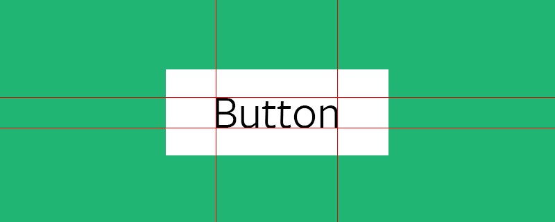
Buttons lead your visitor around your page, you want them to be easy to notice and to read.
- Use special colors sparingly (CTAs).
- Equal padding for top and bottom,** left and right for your buttons / labels. Usually it’s nice to have content in the center of a frame. You don’t want your text too close to your button border. By having the same amount of padding on all sides, this ensures your content will be balanced and centered.
- Equal padding for top and bottom,** left and right for your buttons / labels. Usually it’s nice to have content in the center of a frame. You don’t want your text too close to your button border. By having the same amount of padding on all sides, this ensures your content will be balanced and centered.
Centre-align your text.** It’s hard to go wrong, unless you have a special reason to left or right align. - Create buttons that expand. Apply a minimum width in case the label is very short. You want your buttons to stretch and expand (or shrink) to fit different screen sizes.
- Include hover states. If the style for the hover state is not already given in your template, add a simple darken or lighten function. You want your viewer to see that they’re either about to click on something. Why? This subtle cue helps a user navigate your site.
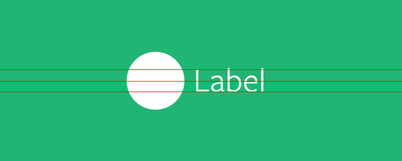
* Icons should be vertical-centre aligned in most cases to go with your labels. Do not take this for granted and check on multiple browsers (Chrome, Firefox, Safari, and even in-app browsing).
* Give appropriate spacing between the icon and label. Even though your prototype may look good, make sure your stylesheet renders spaces properly. People who start out usually put them too close to each other, so try giving 10% more space than your first choice.
* Align in groups (ie. label + text), but the labels should be centre-aligned on their own (for the same reasons mentioned above): <a href="”#”">Run</a>
Typography
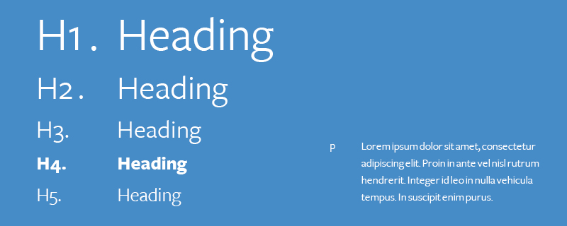
The typography of your site is the first sense of “voice” your visitor will see before the actual content. Most good designers are obsessed about typography, but (if your designer will accept it) consider whether they chose a universal font and what alternative font the site will be rendered in if a user doesn’t have it. Typography is also about spacing, which creates an overall character to your site and helps people read your content.
- Choose universal fonts. Google Fonts is a great place to start. Universal fonts also guarantee that viewers will see what you want them to see (rather than having everything turn to Arial). Also Check Adobe Typekit to see what styles are out there.
- Define your typography style. Use em / remem/ sparingly. On the idea of having responsive content, you want your text to be scalable along with your content. Check this comparison blog post.
- Check line height. Pay attention to the spacing above and below your text. Text that’s too cramped and close to other content is difficult to read, especially on small screens.
- Check letter-spacing. More space is clearer, but too much and the letters get lost. Depending on what font and style you use, you may want to play around with the letter spacing as some fonts look better when the letters are spaced out, and some do not.
- Use margin-bottom to separate text content (i.e. headers from paragraphs). Giving a little bit of space to the bottom of each area gives a clear, visual indication of separation of content.
- Check word-wrap to see if it breaks your layout. Usually, most style sheets are set to have words break at “normal” break points like the end of a word. But other property values will let words “break” at different points like the end of a content area or if the sentence becomes too long the word will break to the next line like in a book.
- Use truncate
(text-overflow: ellipsis)for text that is too long and breaks your UI. You may want to use this if your string of text is really long and overflows your element’s box. It will just add some ellipsis when your text gets to the end of your element’s box.
Layout
Layout is knowing how to arrange the information on your page to guide user behavior. The good news is, the web has many great, responsive templates. Your designer should have already decided whether a simple splash or a newspaper layout is more suitable for your site. As a front-end developer, you need to make sure their design is consistent across all platforms (i.e. web, tablet, mobile).
- Find a suitable framework. We recommend Foundation from Zurb, one of the most powerful responsive front-end frameworks, and Bootstrap.
- Use rows and columns to create your layout. Don’t depend on this once you populate with content. Grids are for basic layouts only.
- DON’T mess with the default grid stylesheet — just don’t do it man.
- Build responsive. Make sure your web design is viewable not only on desktop but can be viewed in response to different sized screens like mobile screens. Your content and elements should float around automatically (and check!). Avoid hard-coding and locking to specific positions. Use a mobile-first approach and add to your CSS style-sheet to accommodate larger screens. It’s easier to go from small to large than the opposite!
Images
- Compress your images. Keep your beautiful hi-res hero images backed up if it’s static content, or if it’s user generated, think about how you will approach this.
- Request SVG if necessary from designers because you will need to scale your images.
- Icon fonts are easier. It will speed up your development if you don’t have an icon set in hand. Usually designed with simple shapes, they can save you text space, free up your web design, and you don’t have deal with all the different asset files!
- Always lock your ratios. When you resize, choose the width or height and have your application auto-calculate the rest; if it isn’t, you haven’t locked the dimensions. Do not DISTORT the image ratio. You don’t want to force images into different sizes or stretch them, the pixels won’t comply and your image won’t look so nice.
- Always check image sizes, dimensions & position. Are they where they’re supposed to be across all the platforms? Are they the right sizes across all platforms? Are they easy to see and scroll past across all platforms?
Tips
- Only use top: 50%, margin -50% / transform -50% if the elements height is fixed and not dynamic.
- In most cases we can use table CSS hack.
- If the parent height is specified you can use inline-block and css:before method.
Or forget everything and use flexbox, time has changed.
CONTENT ALIGNMENT
- As the main contents / paragraph in most cases is left aligned, left align the elements nicely will do the job. etc. Forms / Paragraph / List
- CLEAR and always NORMALISE your CSS stylesheet if you don’t use any frameworks. This will help your alignment issues greatly.
JIGGLED TEXT WHEN USING CSS TRANSITION EFFECT
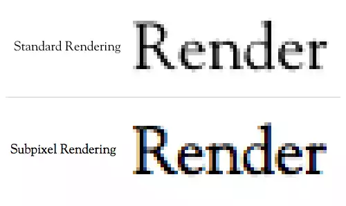
* Because of the text anti-aliasing problem in webkit, add specific anti-aliased text css for the text that are jiggled : -webkit-font-smoothing: subpixel-antialiased;
Subscribe and bookmark our blog if you find this post helpful.
Learn more about us here and follow @Oursky on twitter.
If you are a professional pixel hunter, please share with us! You can also check out the job vacancies at jobs.oursky.com
