
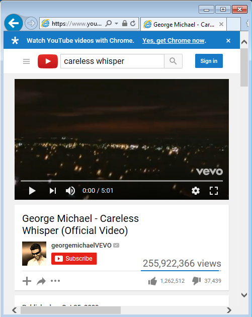
Sticky Headers are a frequently used pattern in front-end web development. At one of our team breakfasts, we saw Youtube’s sticky header break on IE. Yes, IE is an internet relic and always needs a little more support these days to run. But breaks like the Youtube case got some of our team members discussing sticky headers, and we figured we would share it here.
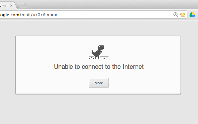
- Warning displays when disconnected from network;
- Navigation breadcrumbs to show menu items;
- Promotional item highlights or important user notices (such as usage policies for cookies)
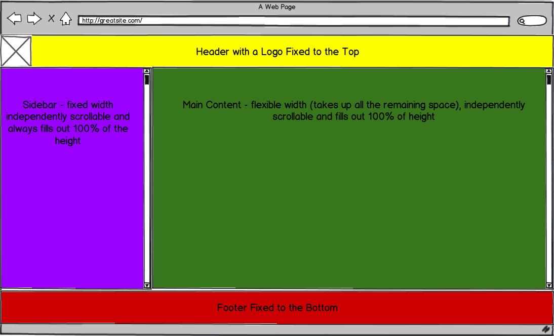
A good sticky header should be prominent but not block the original web content
A sticky header is visually fixed on a constant location throughout browsing. No matter how we implement the sticky property, it reduces the size of the main content. A common mistake is accidentally making the header space so big it is no longer a header. By displaying all the “necessary” links in the header, the content in the main area is squeezed out and unreadable. Calling the right amount of attention is essential.
Different ways to implement a sticky header
There are various ways to implement a sticky header. Below are some options.
Javascript + CSS way
CSS position fixed + JavaScript calculates the height of the header and inserts an appropriate margin-top to the main content. This hybrid method enables the header to fit its content size, but it is relatively more complex than the other methods below.
Table
Use a table to put the header and the main content into different <td>, so that the header never blocks the main body content. The size of the content in the header can be dynamic. However, because it is part of the main frame, the header is actually part of the <table>, so it looks like a table more than a UI with a header.
Pure CSS way
Using purely CSS with a media query is only good when you know the content length in the sticky header because otherwise header content may overflow in an ugly way.
The demo reproduced a case that breaks the UI — when content is way taller than the pre-defined header size, they might be invisible in the layout. You may need to handle the header resizing with simple JS just like the Javascript + CSS way.
Do you always need a sticky header?
Sometimes sticky headers don’t hurt, such as showing a proper warning message when someone is offline and they need to see the content that isn’t loading.
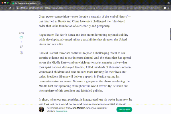
Developers can also consider hiding the header (make it less sticky) when necessary. For example, scrolling up will hide the header to give space for site visitors in Medium.
Sometimes, a sticky header isn’t needed. Alternatives can include a toast (slide up) notification or an in-line notification style.
In the end, all of these may be minor details. Sometimes, it’s worth thinking over how to make something work even if there are more updated solutions over breakfast to start the day.
If you found this piece helpful, give us some claps or *follow Oursky Publication for more startup/entrepreneurship/project management/app dev/design hacks! *👏
😻 At Oursky we’re all about helping brands and entrepreneurs make their ideas happen. Get in touch if you’re looking for a partner to help build your next digital product.

2 comments
Hi, I really like it, specially the CSS method. I am just going to implement sticky footer into my website but I also found another solution here http://codeconvey.com/create-simple-pur-css-sticky-header/ so my question is does this solution also same as yours?
I must appreciate you if you can help me out. Thanks Buddy.