
We’ve been dealing with many many different apps. App quality and usability are always our core values we never settle for less.
There are some common UX mistakes that engineers often overlooked. Getting these discovered and handled, one can build greater apps.
Get ready, here are our top 10:
10. Long text is too long in a text field
You’ve probably met this before. Long text can be really loooooooooooooooooooooooooong.
It’s not the text’s fault.
It’s the text field couldn’t handle that.
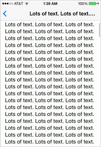
Yet, there are ways to deal with that:
- Truncate the text.
- Overflow the text field, make it scroll.
- Expand the text field.
- Limit the text length!
9. Couldn’t go back in multi-page sign up forms
Sure we love sign-ups!
However at some time, users might need to take a step back to the previous page, and sadly in your app there’s no way doing so! They have to start it all again to amend a single field.

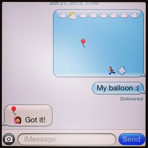
8. Missing out non-alphanumeric characters
Unicode characters and emojis are being popular nowadays.
Without emojis, we don’t even know how to say ? (thanks) or ??? (sorry).
Losing the smileys and turn them into unknown characters will take away your users’ smileys.
Mind that!
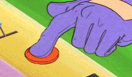
7. Didn’t handle button being clicked repeatedly
We all know users can be like monkeys when they get frustrated. Hold on, don’t crash on it!

Make sure the button events are not fired repeatedly out of our expectation.
A simple button pressed feedback mechanism (loading/ or hide the button) should do the job.
6. No visual hints when it’s busy loading
Slow loading is better than no loading.
Never let your app freeze (or appear to be frozen) when data loads. Users don’t mind a bit waiting, but would just like to know that the app is still running.
Provide visual hints that the app is still alive while it loads.

5. A pressed button doesn’t look like pressed
That’s confusing – we feel natural to receive feedback when we interact with another object. A little bit of laziness on adding an active state to your buttons loses your smoothness and consistency.
4. Confusing choices in alert prompts
When your prompt requires a user response, you should make sure to ask a clear question so that one can answer right away.
Asking bad questions or provide confusing choices might cause a panic.

There are guidelines for alert prompts, follow them.
3. Things broken on orientation changed
It’s common that users put their phones in different orientations when using the app. It’s also kinda common for developers not bearing in mind to test through their apps in different orientations.
Changing orientation (e.g. from portrait to landscape) triggers a interface redraw, and most of the elements on the screen are relocated in different positions. That involves calculations. Often mistakes were made here, while your users will never stop rotating…rotating…rotating…

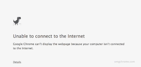
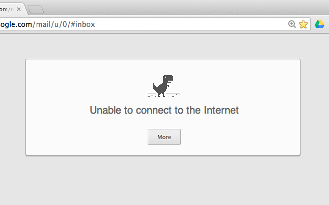
2. Fail to handle bad network connection
Most of the apps now requires connection to the server. However there are moment that users are offline.
Handling no network connection issue is a common practice. They need it.
Google did a nice job here on Chrome (to kill your time)
1. Bad error message
Probably it’s the most annoying situation that hangs the user around.
That only leaves nothing but a frustrated user that never uses your app again.

Give a proper message to keep the user updated on what’s happening. That saves the user and saves your app.
Conclusion
The best app should do what it supposes to do and avoid annoying users.
By understanding potential UX problems that hinder the app usage, we are able to tackle them early in the development stage.
The point is, users never use your app perfectly as expected. Stay alerted for the worse and juggle with them will make your app inevitable.
Do you have more of them? Comment and share with us!
By the way.
We’ve also made life-saver tools for app developers. Check them out!
- MakeAppIcon – Generates App Icons for iOS and Android in a click.
- MockUphone – One Click to Wrap App Screenshots in Device Mockup.
Subscribe and follow @Oursky on twitter to get the latest updates about the Code Blog @ Oursky.


6 comments
I have also been doing some of those mistakes and many people do. So thanks for sharing this article it is very useful to me.
Web Design Company
Excellent analysis – For what it’s worth if you are wanting a a form , I found a blank document here http://goo.gl/3Df4sY.
THanks Johnie! Glad you enjoyed it.
Hey,
add “content just finished loading and disappears out of nowhere right when I am about to click”…
But good list – I can relate!